|
|
Step 1: Choose Your Starting Website Layout
Please choose one of the over 120 design templates shown below by clicking the name or thumbnail of the template. All the photos and text on each design template may be changed at any time using our simple point and click tools. We offer a large stock library of images OR you can upload your own!
New designs are added frequently... And you may change your design choice at any time after you become a member! One mouse click and all of your existing information is transfered to a new design.
You can actually change the look of your website with each season if you wish!
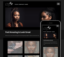
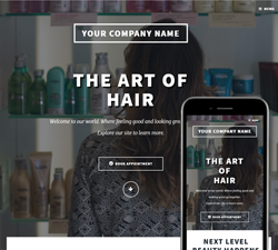
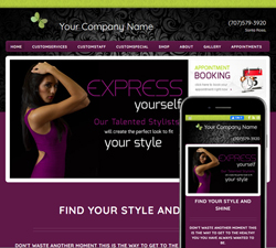
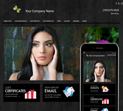
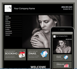
Alignment, Black
Features: New Service Graphics on Home Page, Customizable Colors, and Mobile Optimized

|
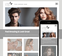
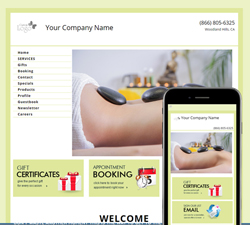
Alignment, White
Features: New Service Graphics on Home Page, Customizable Colors, and Mobile Optimized
|
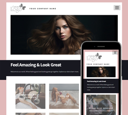
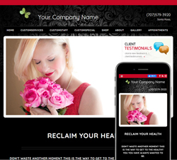
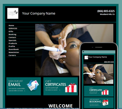
Alignment, Pink
Features: New Service Graphics on Home Page, Customizable Colors, and Mobile Optimized
|
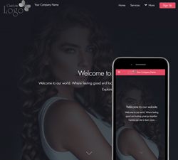
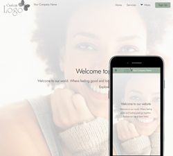
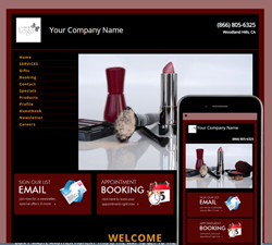
Vibes, Black
Features: New Responsive Layout optimized for both mobile and desktop, Customizable header and colors
|
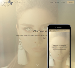
Vibes, White
Features: New Responsive Layout optimized for both mobile and desktop, Customizable header and colors
|
Vibes, Gold
Features: New Responsive Layout optimized for both mobile and desktop, Customizable header and colors
|
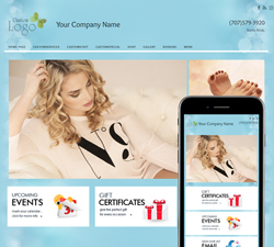
Big Picture, Serenity
Features: New Responsive Layout optimized for both mobile and desktop, Customizable header, Featured Tiles and Featured Items section
|
Big Picture, Attraction
Features: New Responsive Layout optimized for both mobile and desktop, Customizable header, Featured Tiles and Featured Items section
|
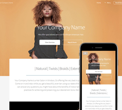
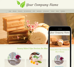
Big Picture, Natural
Features: New Responsive Layout optimized for both mobile and desktop, Customizable header, Featured Tiles and Featured Items section
|
Big Picture, Vibrance
Features: New Responsive Layout optimized for both mobile and desktop, Customizable header, Featured Tiles and Featured Items section
|
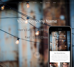
Big Picture, Radiate
Features: New Responsive Layout optimized for both mobile and desktop, Customizable header, Featured Tiles and Featured Items section
|
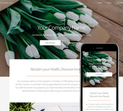
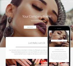
Big Picture, Lush
Features: New Responsive Layout optimized for both mobile and desktop, Customizable header, Featured Tiles and Featured Items section
|
Chrome, Allure
Features: New Responsive Layout optimized for both mobile and desktop, Customizable logo/header, Featured Tiles and Featured Items section
|
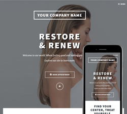
Chrome, Restore
Features: New Responsive Layout optimized for both mobile and desktop, Customizable logo/header, Featured Tiles and Featured Items section
|
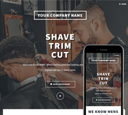
Chrome, Strong
Features: New Responsive Layout optimized for both mobile and desktop, Customizable logo/header, Featured Tiles and Featured Items section
|
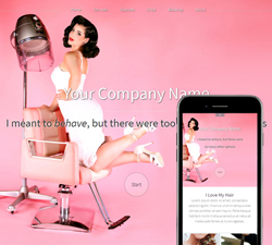
Hazel, Pinup
Features: New Responsive Layout optimized for both mobile and desktop, Customizable header, Featured Tiles and Featured Items section
|
Hazel, Wood and Metal
Features: New Responsive Layout optimized for both mobile and desktop, Customizable header, Featured Tiles and Featured Items section
|
Hazel, Vivid Beauty
Features: New Responsive Layout optimized for both mobile and desktop, Customizable header, Featured Tiles and Featured Items section
|
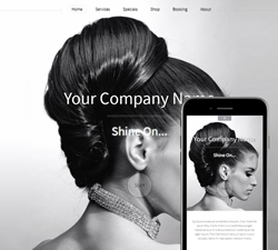
Hazel, Shine
Features: New Responsive Layout optimized for both mobile and desktop, Customizable header, Featured Tiles and Featured Items section
|
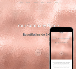
Hazel, RoseGold
Features: New Responsive Layout optimized for both mobile and desktop, Customizable header, Featured Tiles and Featured Items section
|
Hazel, Alive
Features: New Responsive Layout optimized for both mobile and desktop, Customizable header, Featured Tiles and Featured Items section
|
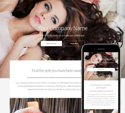
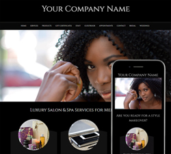
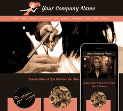
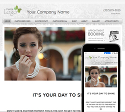
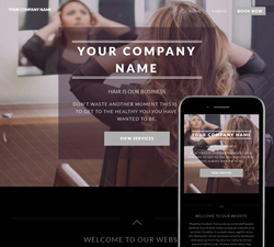
Attraction, Salon
Features: New Responsive Layout optimized for both mobile and desktop, Changeable Full screen background, Customizable header
|
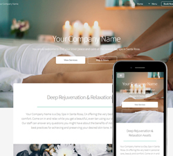
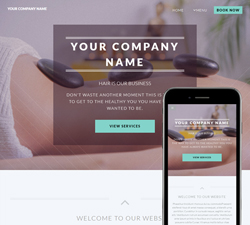
Attraction, Spa
Features: New Responsive Layout optimized for both mobile and desktop, Changeable Full screen background, Customizable header
|
Attraction, Nails
Features: New Responsive Layout optimized for both mobile and desktop, Changeable Full screen background, Customizable header
|
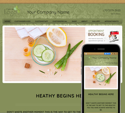
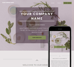
Natural, Spa
Features: New Responsive Layout optimized for both mobile and desktop, Changeable Full screen background, Customizable header, Featured Tiles and Featured Items section
|
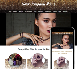
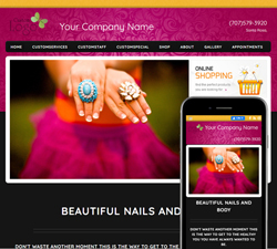
Glitter, Nails
Features: New Responsive Layout optimized for both mobile and desktop, Changeable Full screen background, Customizable header, Featured Tiles and Featured Items section
|
Pure, Black
Features: New Responsive Layout optimized for both mobile and desktop, Changeable Full screen background, Customizable header, Featured Tiles and Featured Items section
|
Pure, White
Features: New Responsive Layout optimized for both mobile and desktop, Changeable Full screen background, Customizable header, Featured Tiles and Featured Items section
|
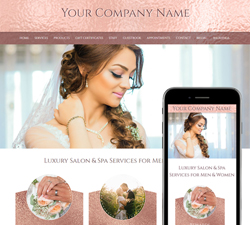
RoseGold, Wedding
Features: New Responsive Layout optimized for both mobile and desktop, Changeable Full screen background, Customizable header, Featured Tiles and Featured Items section
|
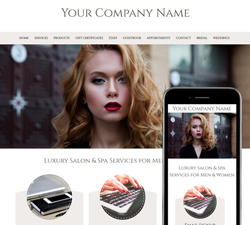
Vintage, Salon
Features: New Responsive Layout optimized for both mobile and desktop, Changeable Full screen background, Customizable header, Featured Tiles and Featured Items section
|
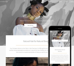
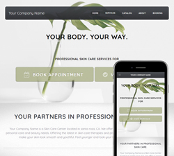
Solid, Organic
Features: New Responsive Layout optimized for both mobile and desktop, Customizable header, Featured Tiles and Featured Items section
|
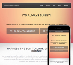
Solid, Glow
Features: New Responsive Layout optimized for both mobile and desktop, Customizable header, Featured Tiles and Featured Items section
|
Solid, Wellbeing
Features: New Responsive Layout optimized for both mobile and desktop, Customizable header, Featured Tiles and Featured Items section
|
Stylish, Salon
Features: New Responsive Layout optimized for both mobile and desktop, Changeable Full screen background, Customizable header, Featured Tiles and Featured Items section
|
Stylish, Spa
Features: New Responsive Layout optimized for both mobile and desktop, Changeable Full screen background, Customizable header, Featured Tiles and Featured Items section
|
Stylish, Nails
Features: New Responsive Layout optimized for both mobile and desktop, Changeable Full screen background, Customizable header, Featured Tiles and Featured Items section
|
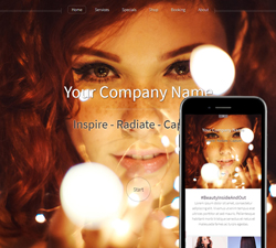
Inspire Action, Black
Features: New Responsive Layout optimized for both mobile and desktop, Slideshow Photos, Customizable header, Featured Tiles and Featured Items section
|
Inspire Calm, White
Features: New Responsive Layout optimized for both mobile and desktop, Slideshow Photos, Customizable header, Featured Tiles and Featured Items section
|
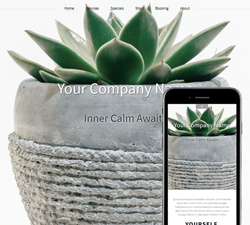
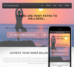
Inspire Balance, Green
Features: New Responsive Layout optimized for both mobile and desktop, Slideshow Photos, Customizable header, Featured Tiles and Featured Items section
|
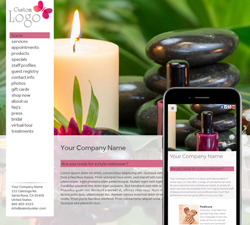
Inspire Fun, Pink
Features: New Responsive Layout optimized for both mobile and desktop, Slideshow Photos, Customizable header, Featured Tiles and Featured Items section
|
Inspire Luxury, Purple
Features: New Responsive Layout optimized for both mobile and desktop, Slideshow Photos, Customizable header, Featured Tiles and Featured Items section
|
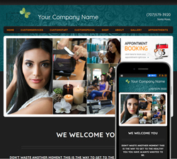
Inspire Welcome, Teal
Features: New Responsive Layout optimized for both mobile and desktop, Slideshow Photos, Customizable header, Featured Tiles and Featured Items section
|
Inspire Elegance, Cranberry
Features: New Responsive Layout optimized for both mobile and desktop, Slideshow Photos, Customizable header, Featured Tiles and Featured Items section
|
Inspire Relaxation, TanBlue
Features: New Responsive Layout optimized for both mobile and desktop, Slideshow Photos, Customizable header, Featured Tiles and Featured Items section
|
Inspire Trust, GreyBlue
Features: New Responsive Layout optimized for both mobile and desktop, Slideshow Photos, Customizable header, Featured Tiles and Featured Items section

|
Dynamic, Black
Features: New Responsive Layout optimized for both mobile and desktop, Customizable header and colors
|
Dynamic, Grey
Features: New Responsive Layout optimized for both mobile and desktop, Customizable header and colors
|
Dynamic, White
Features: New Responsive Layout optimized for both mobile and desktop, Customizable header and colors
|
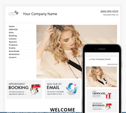
Essential, White
Features: New Responsive Layout optimized for both mobile and desktop, Slideshow Photos, Customizable header, Featured Tiles and Featured Items section
|
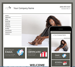
Essential, Black
Features: New Responsive Layout optimized for both mobile and desktop, Slideshow Photos, Customizable header, Featured Tiles and Featured Items section
|
Essential, Blue
Features: New Responsive Layout optimized for both mobile and desktop, Slideshow Photos, Customizable header, Featured Tiles and Featured Items section
|
Professional, White
Features: New Responsive Layout optimized for both mobile and desktop, Slideshow Photos, Customizable header, Featured Tiles and Featured Items section
|
Professional, Grey
Features: New Responsive Layout optimized for both mobile and desktop, Slideshow Photos, Customizable header, Featured Tiles and Featured Items section
|
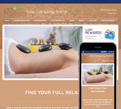
Professional, Green
Features: New Responsive Layout optimized for both mobile and desktop, Slideshow Photos, Customizable header, Featured Tiles and Featured Items section
|
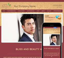
Professional, Black
Features: New Responsive Layout optimized for both mobile and desktop, Slideshow Photos, Customizable header, Featured Tiles and Featured Items section
|
Professional, Teal
Features: New Responsive Layout optimized for both mobile and desktop, Slideshow Photos, Customizable header, Featured Tiles and Featured Items section
|
Professional, Red
Features: New Responsive Layout optimized for both mobile and desktop, Slideshow Photos, Customizable header, Featured Tiles and Featured Items section
|
|
|
|
|